Lies, Damned Lies, and Statistics
Data Visualization
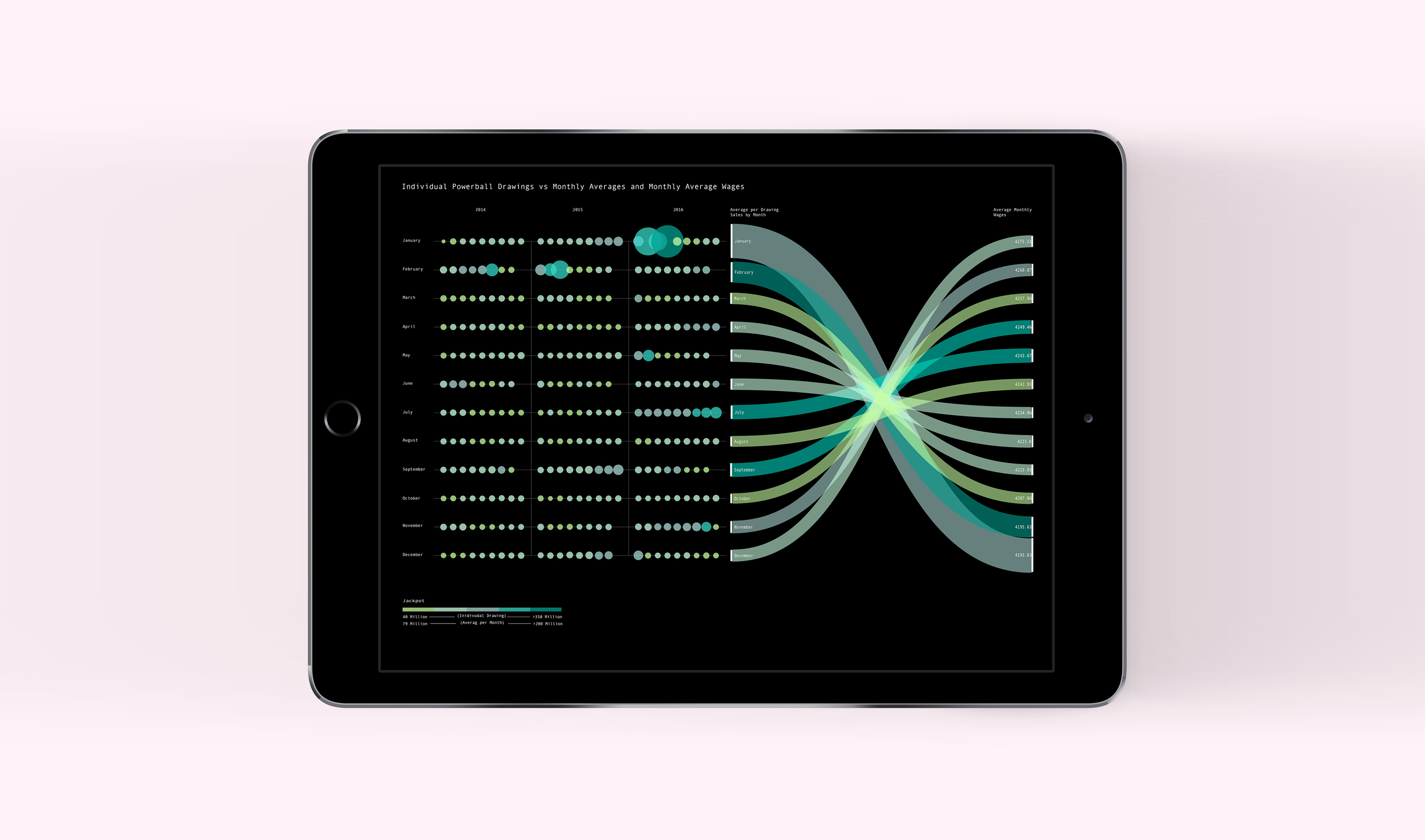
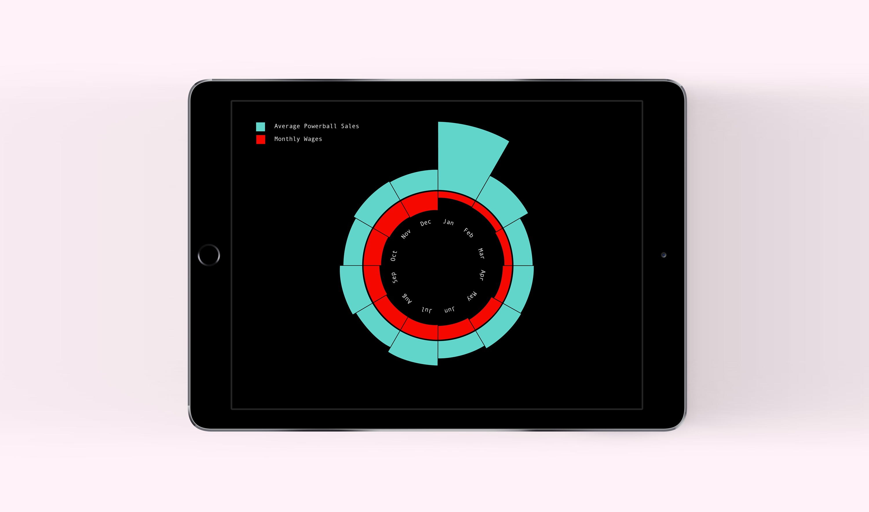
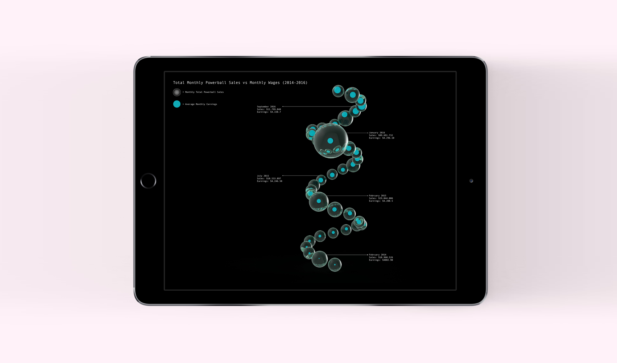
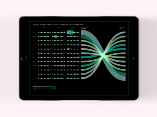
As part of my graduate studio, we were asked to take two unrelated data sets and present them in a way that made them appear to relate to each other. The goal of the project was to better understand the relationship between visual form and how data is interpreted, or how can the graphical display of data affect a viewer’s understanding? As a designer, I have a responsibility to understand how the presentation of information can change a viewer’s interpretations. This is especially relevant today in what has become a “post truth” society. For the visualizations, I explored two dimensional, three dimensional, and video representations.
I chose to work with these data sets:
Ticket Sales for the NC Powerball (2014-2016), Provided by NC Education Lottery
Average Monthly Wages for NC (2014-2016), From the National Bureau of Labor Statistics
Software: Excel, Illustrator, AfterEffects, Maya