
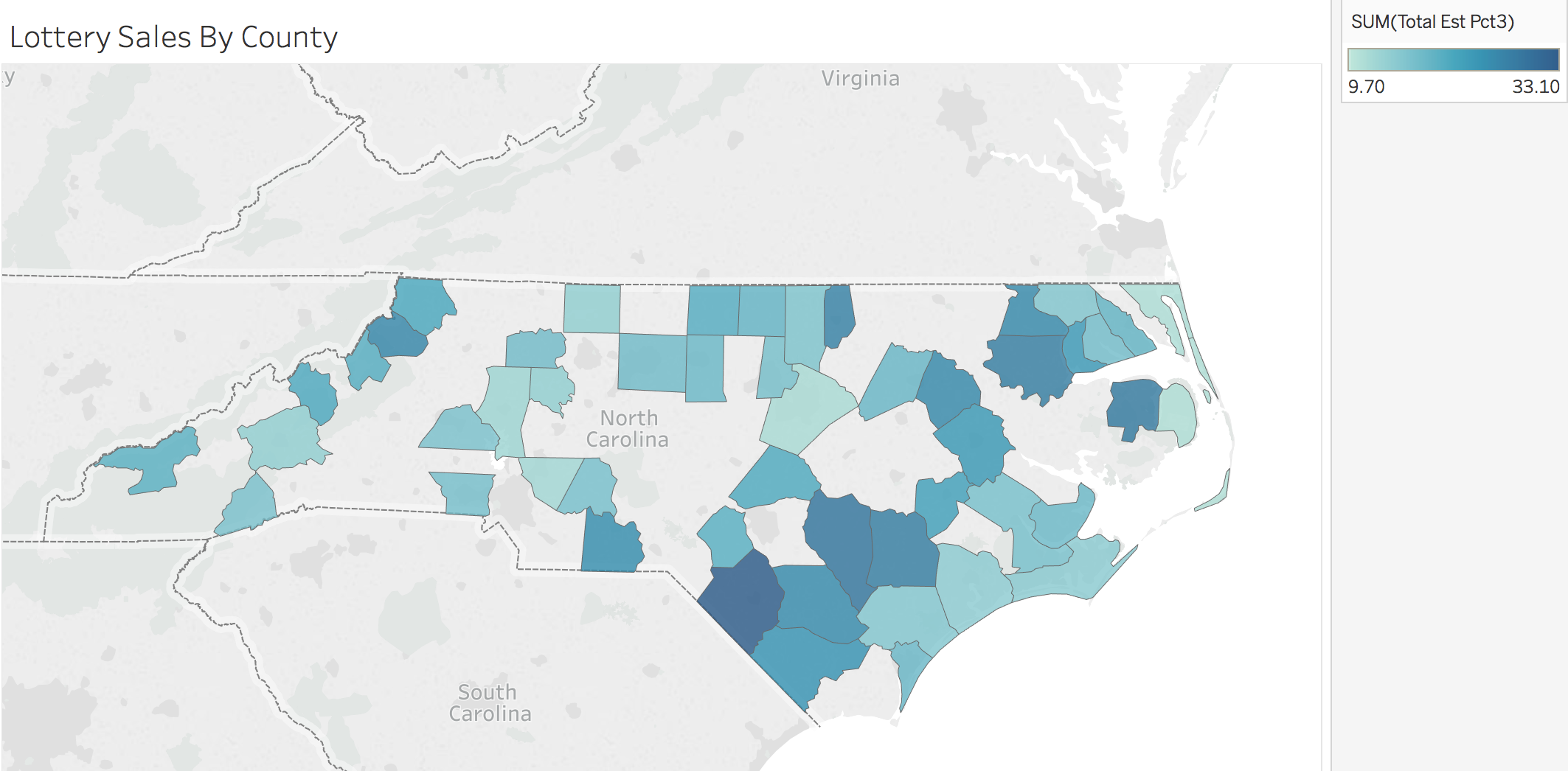
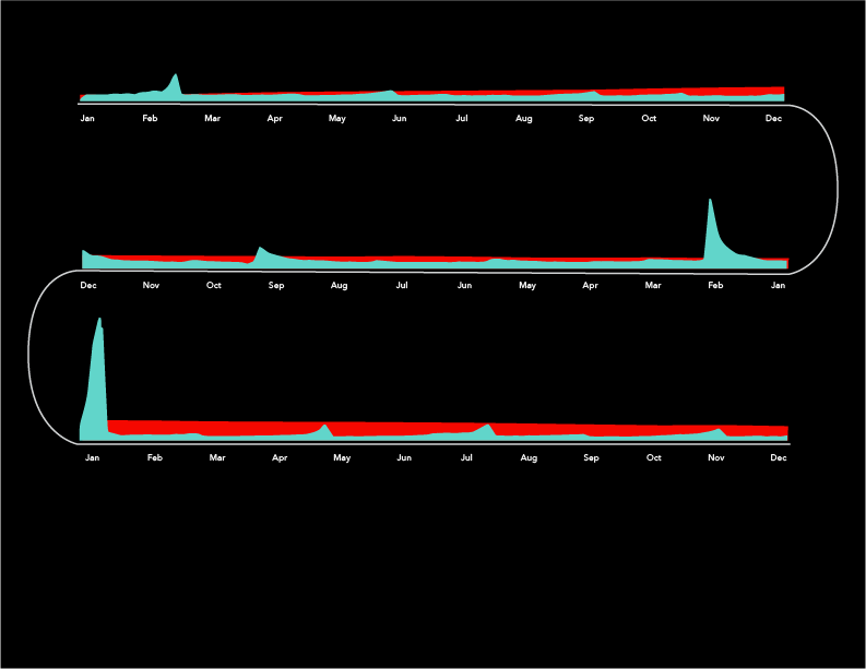
I chose data sets with meanings that interested me, rather than ones with visual similarities, specifically, North Carolina Powerball ticket sales and average monthly wages for North Carolina. This meant I had little existing similarities to work with and pushed me to play with the data statistically. I found that playing with averages made it easier to see patterns and relationships between the two data sets. Early in the year, Powerball sales spike, while average income is at its lowest point, a pattern I exaggerated to suggest a negative correlation. Averaging also adds to the deception of the visualizations and gave me greater power to play with meaning.
Early iterations and process work built off of existing data visualization techniques. These felt stale and unoriginal. I found visualizations that pushed the boundaries of how much information should be presented at once more interesting and that’s reflected in the final visualizations.
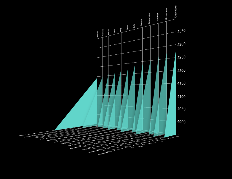
My original iterations were made in Tableau and Illustrator. Later visualizations were created in Illustrator, Maya, and After Effects.