MedChallenge Scoring System
UX Design
UI Design
Shortly after I started at WebMD / Medscape, we launched a quiz game for doctors and medical professions. The beta version of the game had a straight forward scoring model, 5 points for every correct answer, which meant most games ended in a tie. We found user enthusiasm was low and the game was not as exciting as initially hoped.
I was tasked with designing a scoring system that would increase user excitement and allow for more variation in scores and create more excitement during gameplay. I began the project with a competitive analysis of other quiz apps, like Kahoot! and QuizUp.
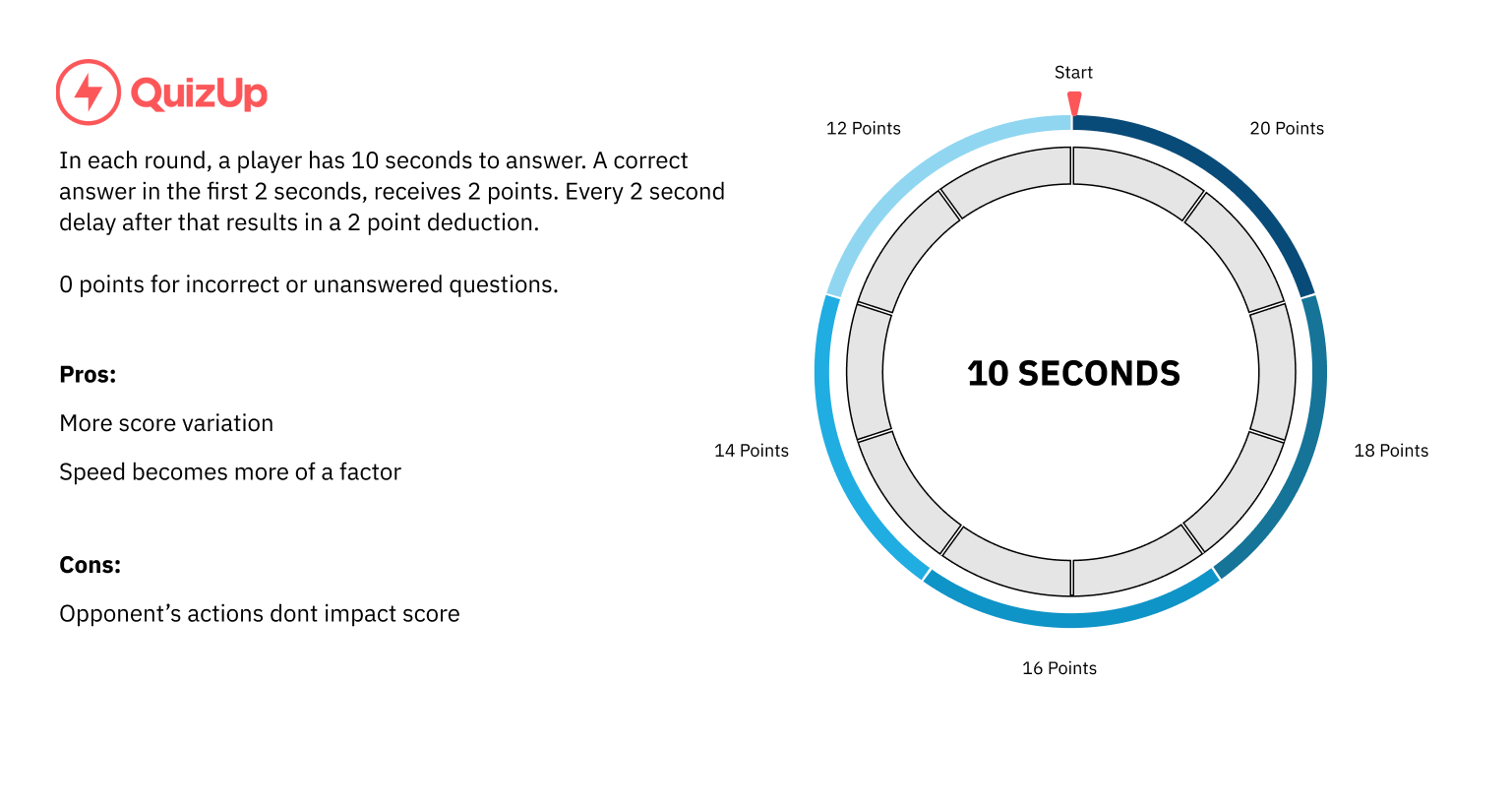
QuizUp’s scoring system is based on time to answer.
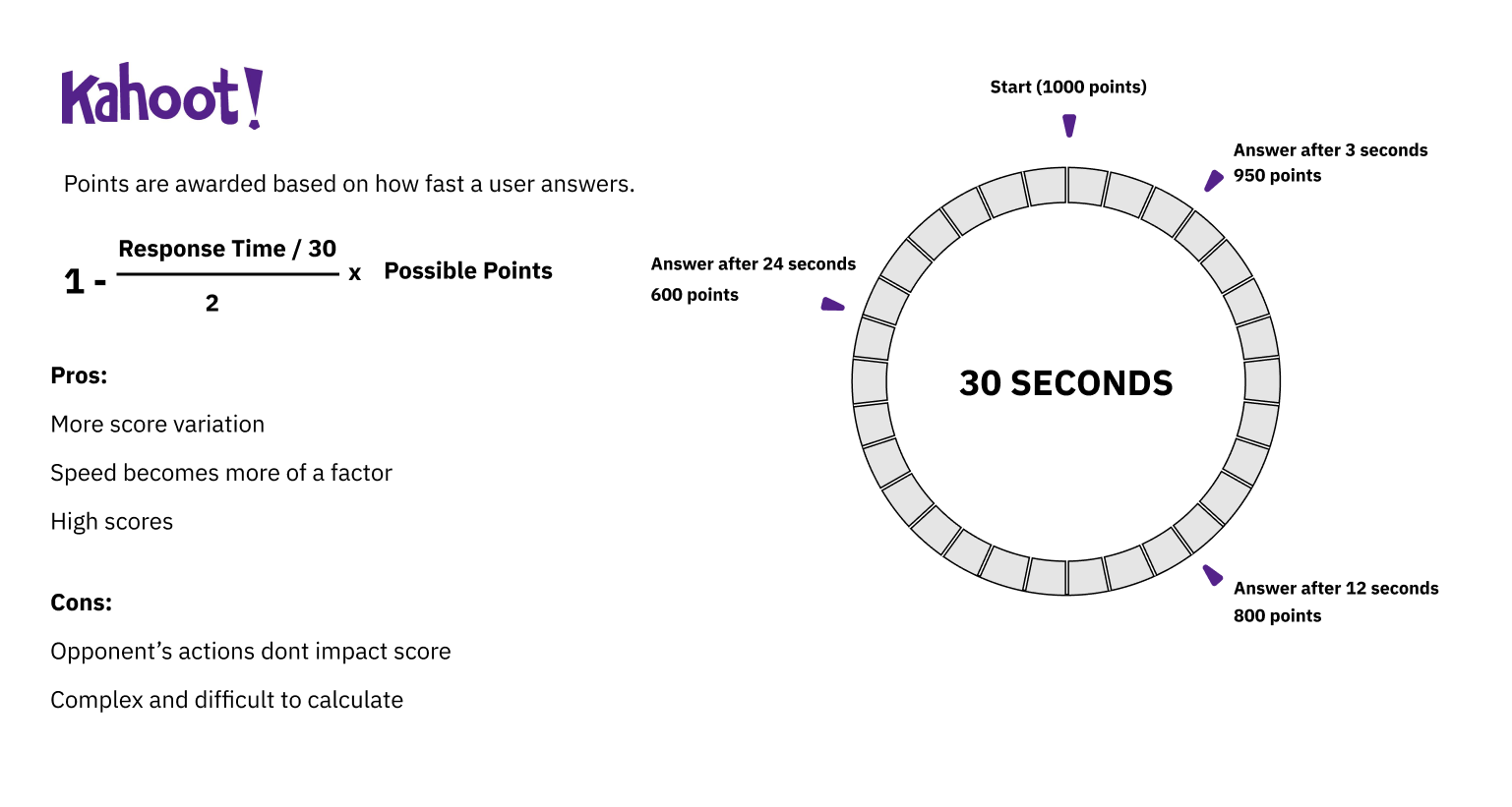
Kahoot! also has a time based scoring system, but it results in higher scores.
After looking at other scoring systems, I iterated on a few different possible solutions. Working directly with a developer, we created modified versions of our applications and tested them in house with different volunteers. The final system was based on how fast a player answers and if the player answers before or after an opponent. This created more variation in scores, leading to more wins and losses. We also intentionally coded the final system to allow for future improvements, like a “lightening round” bonus for specific questions and a bonus for beating a player at the top of the app’s leaderboard.
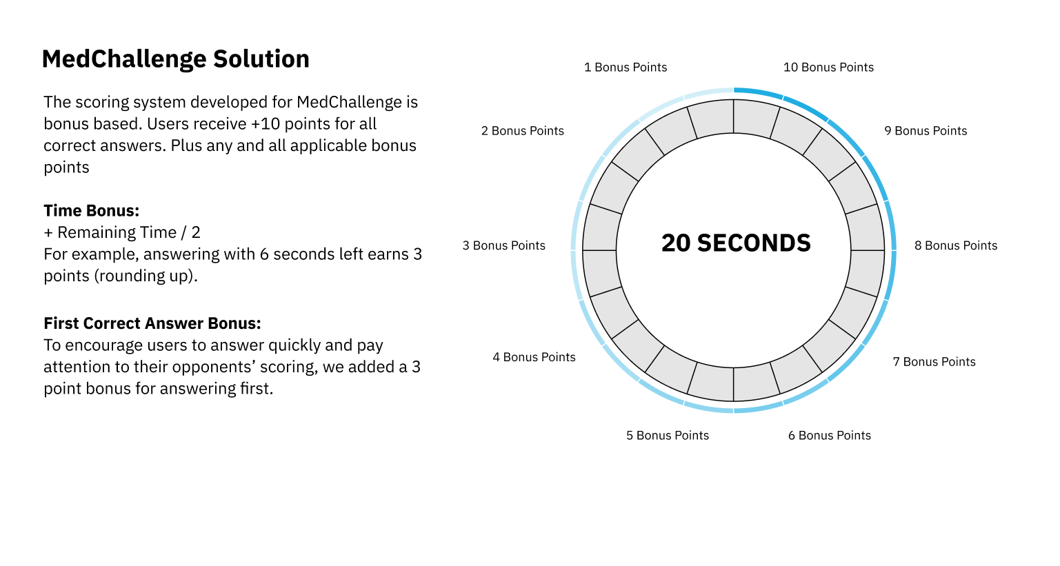
MedChallenge’s scoring system provides bonuses for both time and being the first player to score.
The final scoring system led to greater differences in player scores. We found participants more engaged in the game, actively trying to score faster. User surveys showed greater satisfaction with the game and we saw an increase in the number of challenges played by each player.


