

At North Carolina State University, students to identify a specific design investigation in their final year, which culminates in the required final project. For this work, students research an area of interest, design propositional artifacts (findings), document the research and findings in a written thesis, and present the project in a public forum. My thesis focused on visualizing uncertainty in data journalism aimed at a non-expert audience.
Abstract
Data journalism has become a pervasive part of mass media, with infographics and visualizations appearing in print, online, and in television coverage. While visualizations in mass media can render data accessible to the public, they can also give viewers a false sense of truth and certainty. Uncertainty, meaning incomplete or imperfect data, exists in all information and visualizations; it can be introduced during collection, analysis, or even visualization, but it is often left out of information visualizations. Conveying the uncertainty involved in a data set provides viewers with a fuller picture and more robust understanding of an issue.
Currently, there is not a robust, perceptually-sound visual language for conveying that uncertainty. While there are methods for visualizing uncertainty in scientific or statistical figures, those graphics are typically created for audiences familiar with the visual language of scientific data, making them inaccessible to non-expert audiences. This provides an opportunity for graphic design methods and research to expand those techniques to non-expert audiences. Drawing from graphic design methods and frameworks, in addition to statistical and scientific methods for conveying uncertainty, this study explores new techniques that data journalists can use to convey uncertainty in statistical and scientific information to a non-expert audience.
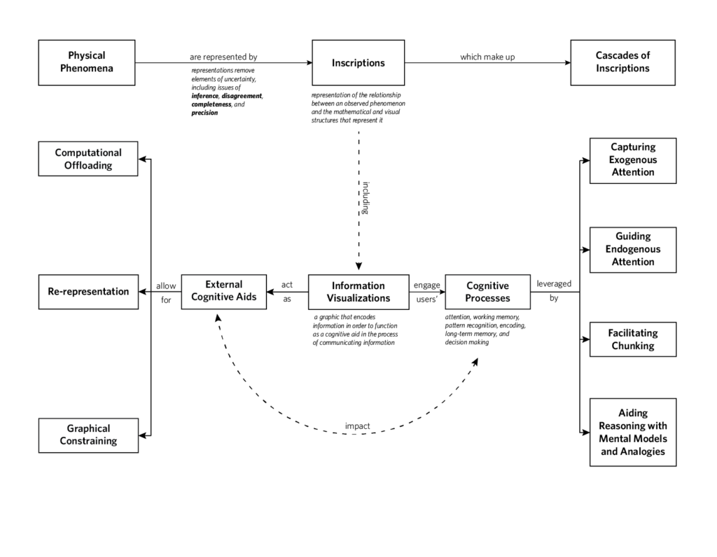
My final project involved a series of studies that explore how uncertainty can be conveyed to a non-expert audience. These studies are based off of a human cognition framework for data visualization and different data sets. This allowed me to explore different possible representations of uncertainty across contexts and situations.
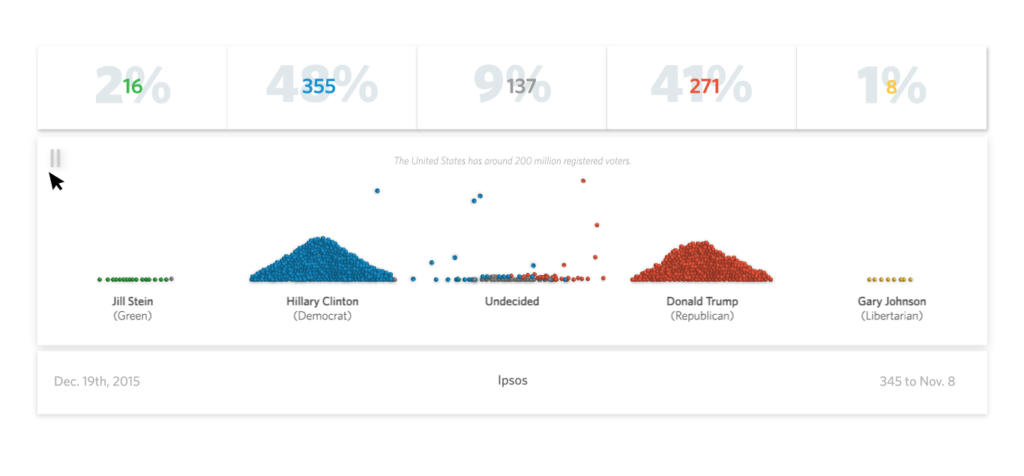
The graphic uses the metaphor of bouncing balls to represent the relationship between a poll and the total population.
This graphic gives a user control over the data points involved in a polling projection, allowing users to analyze the data and determine their own conclusions.
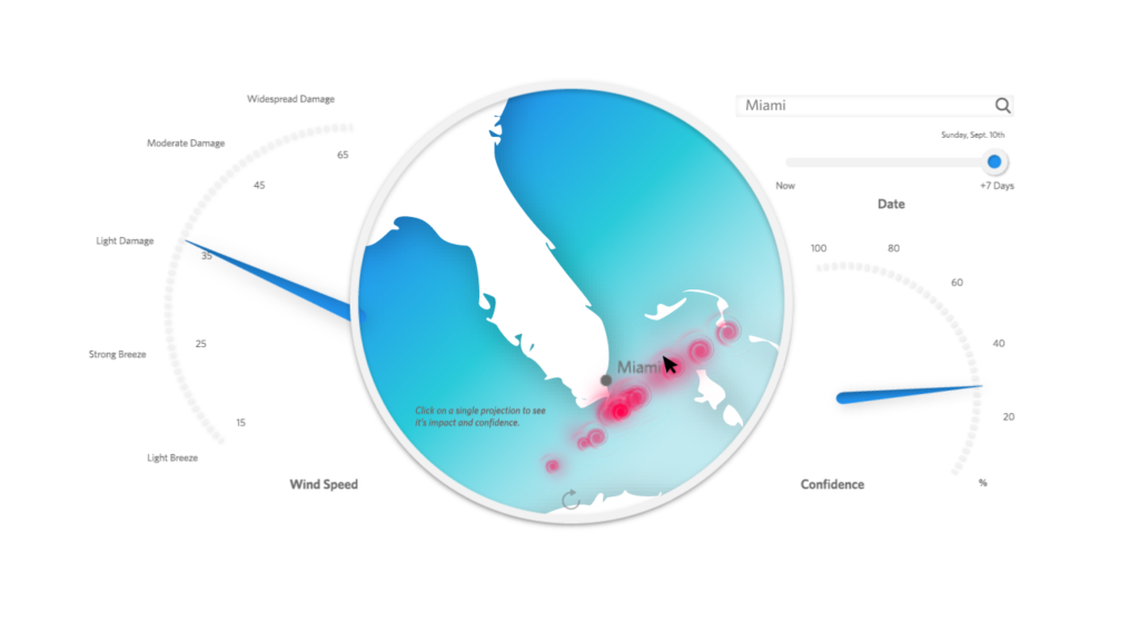
This visualization uses a familiar dashboard structure as a metaphor to convey the disagreement between different hurricane forecasts.
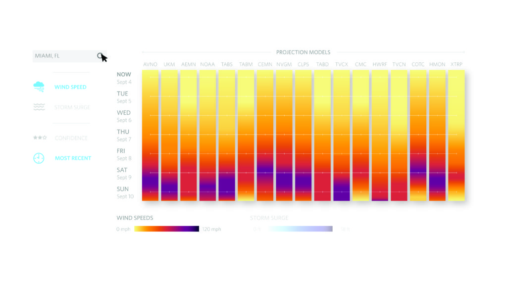
This graphic aims to convey uncertainty surrounding a hurricane forecast. A user can customize the projections to a specific location and play with the graphic to better understand how the forecast may impact them.